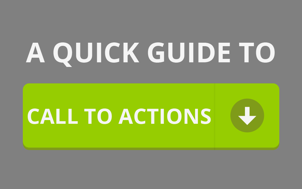
“Call to Actions”, or CTAs, are an important part of any company’s marketing strategy. These CTAs are the devices a business uses in order to prompt a response from potential customers. Whether it’s in order to gain customers or to sell a product, there is a good and bad way to create a call to action.
Many CTAs compliment a site’s value proposition and further encourage a person to interact with the website. Having a strong value proposition is important because it should summarizes the purpose of that site and convince people to answer the call to action. Check out this article about creating a good value proposition for your businesses’ website.
Good CTAs
“Good” CTAs depend on a lot of different factors: is your call to action clear? is the language persuasive? is it visible? There are many different aspects that can make or break your CTA. Check out this helpful article from Sprout Social on how to improve your CTA phrasing.
Netflix
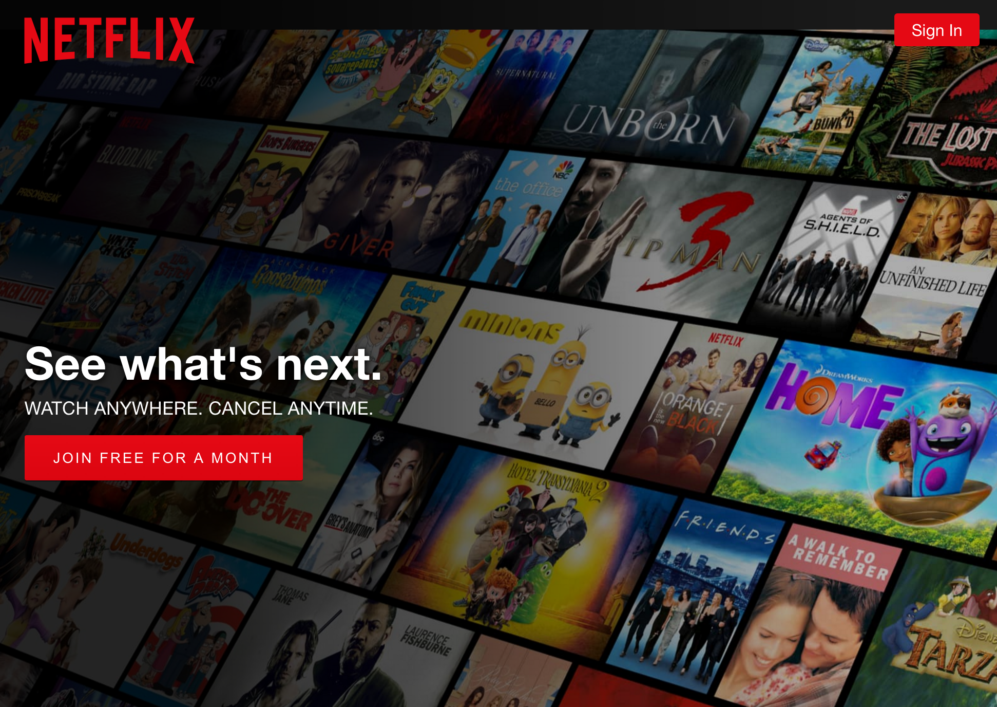
Netflix’s CTA works well with their value proposition, and further entices potential customers. Since their value proposition encompasses their services effectively, the CTA further encourages anyone to subscribe. The CTA is also clear, emphasized in red, and is not hard to find on the page.
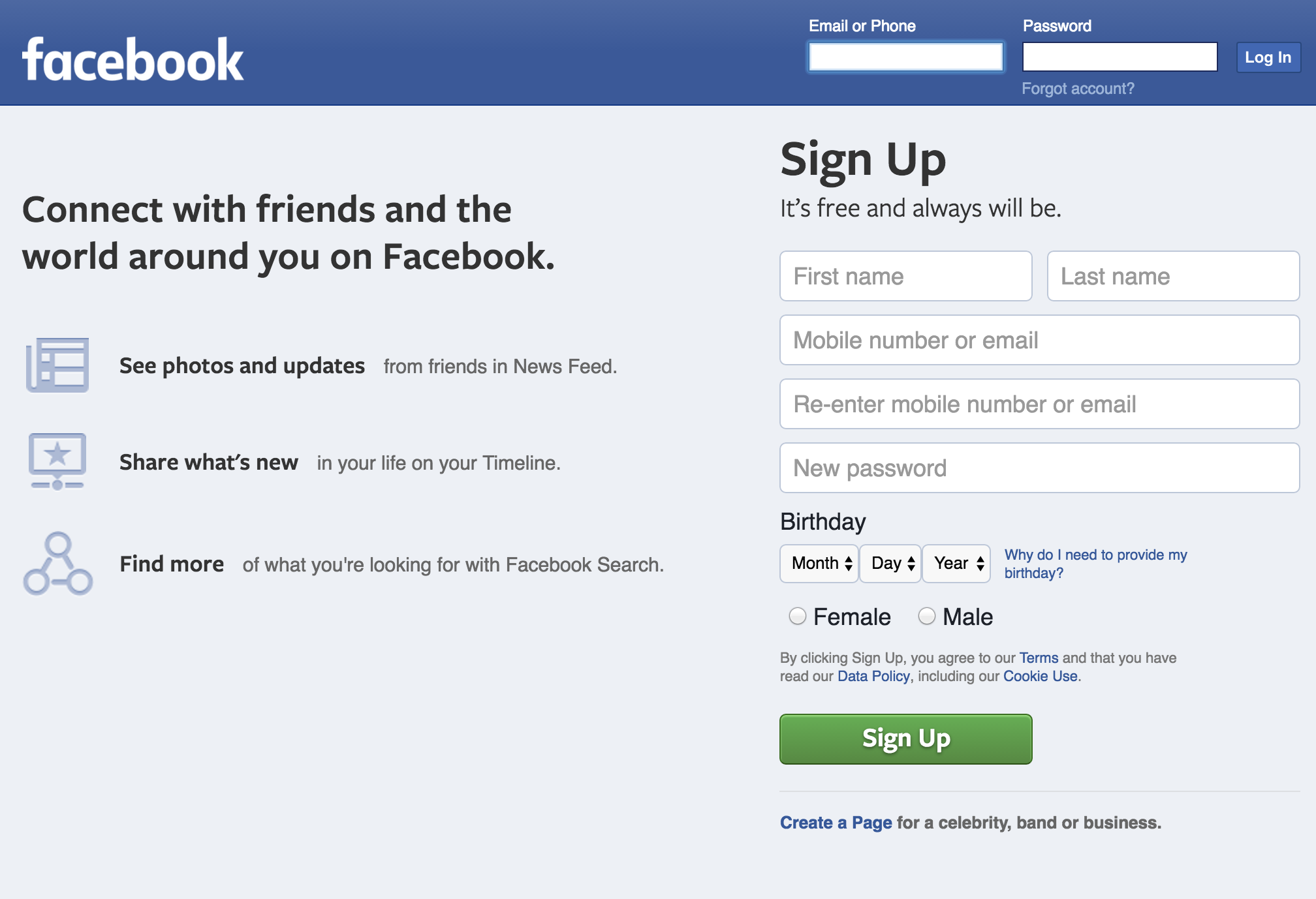
Facebook’s CTA makes it convenient for anyone to make an account on the first page they see. With their value proposition to the left, and having an easy sign up process on the right, all of this works together to further push people towards the CTA.
Spotify
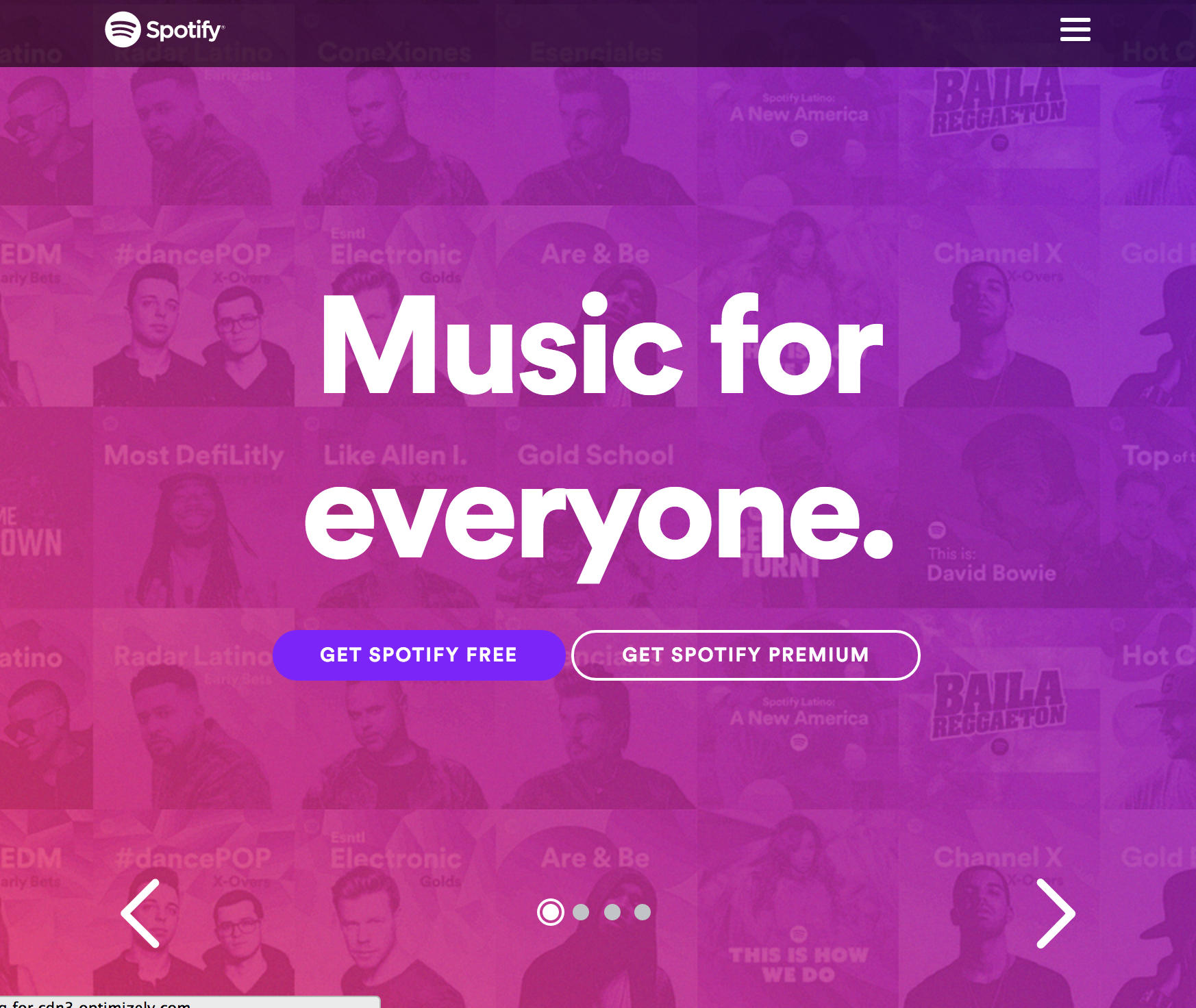
Spotify’s “Music for everyone” value proposition, again works well with it’s CTA. Effectively summarizing the site’s services and then having the CTAs below pushes people towards answering it. Spotify also offers two different CTAs: a free option and a “premium” option. On other pages that also offer different deals for students and families. Deals on pricing are also effective methods to get people to answer the CTA as they think they are saving money.
Square
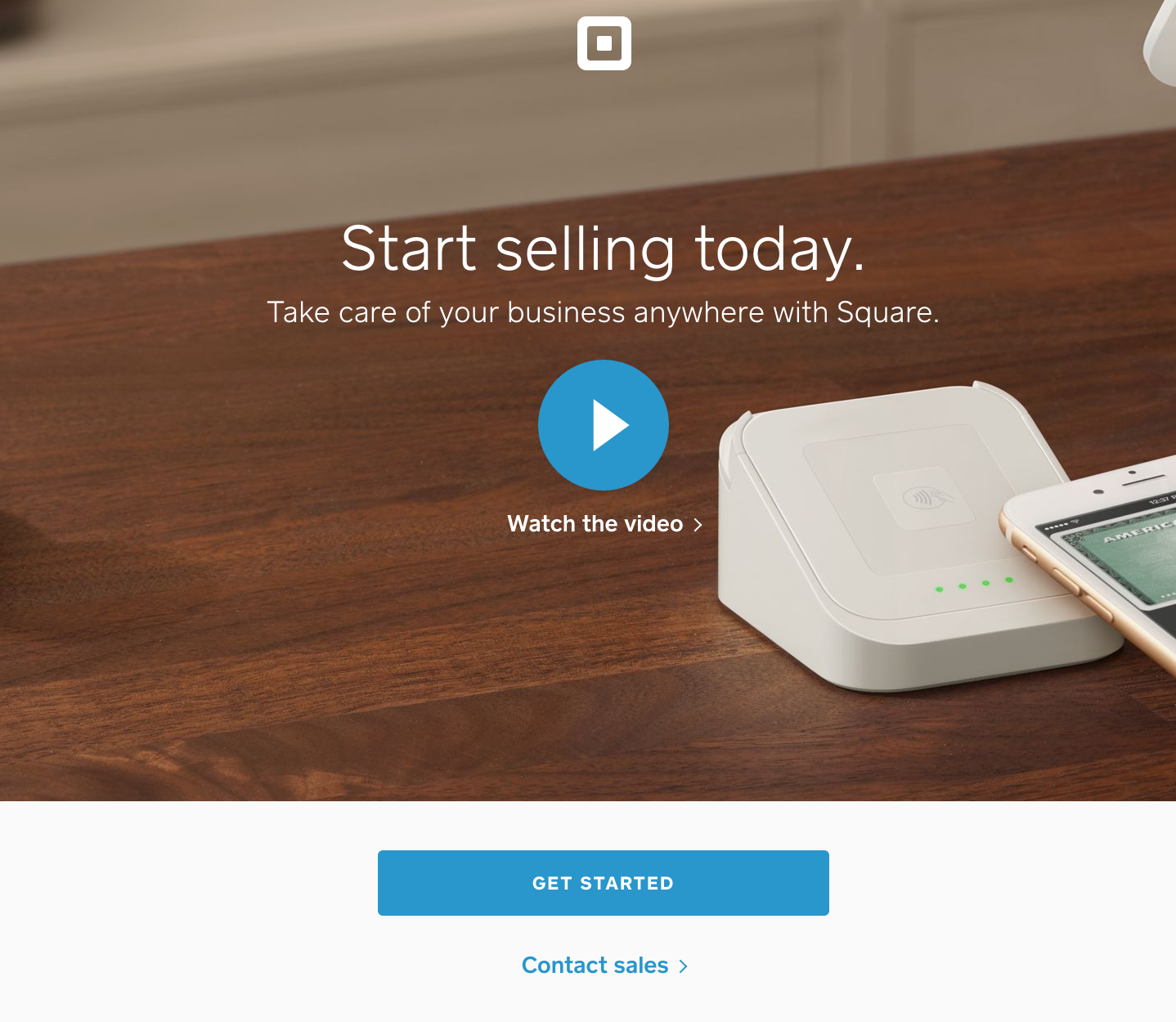
Square does something different and adds a video to accompany their value proposition. Going a step further to explain their product in detail will give people a better understanding of what it is, why they would want to purchase it, and how.
Uber
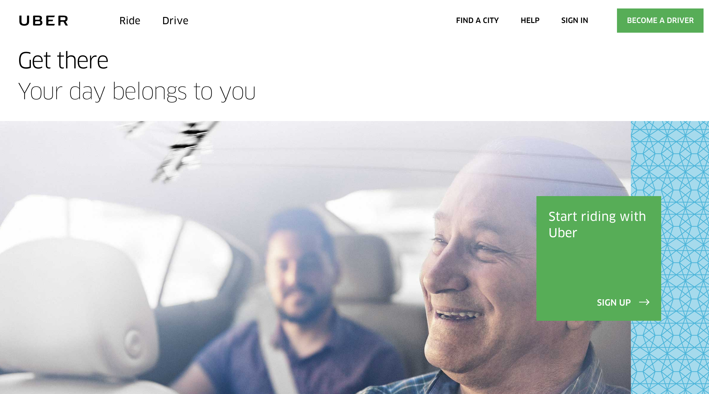
Uber’s site does a good job with phrasing their CTAs for both riders and drivers. “Start” is a great word to use in a CTA because it doesn’t sound too forceful or permanent. It makes people assume that they have an option to end the service later if need be. “Become” is also an appealing word because it makes the job sound appealing and even simple. Check out the Sprout Social article above about the importance of CTA phrasing.
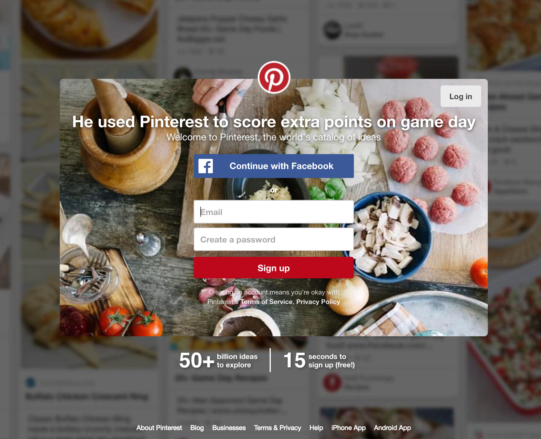
Many sites today connect with Facebook and allow new users to use the same login information. This makes it easy for anyone to automatically create an account and connect with other social media pages. On the other hand if you don’t want to use your Facebook account, you have an email option as well.
Blue Apron


Blue Apron also accompanies their value proposition with a video, and also explains their product in detail as you scroll down the page. They also have three different CTAs at the top and bottom of the page. There is a “sign up” option in the upper right hand corner, “get cooking” at the bottom of the page, and a deal offer at the top of the page. Blue Apron has placed CTAs all over their front page which almost pressures people to answer it.
Bad CTAs
Bad CTAs can range from a lot of issues. The call could not be clear, or visible, and if the site’s value proposition isn’t clear to consumers, it makes the CTA pointless.
Jobsite
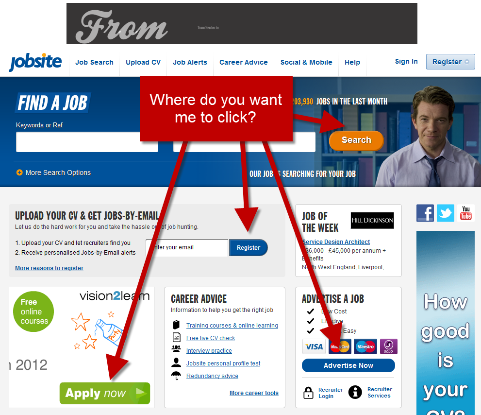
This is an old design of Jobsite’s page, but a helpful example still. They have an excessive amount of CTAs that use different phrases and do not accomplish the same goal, which can be overwhelming.
University of Advancing Technology
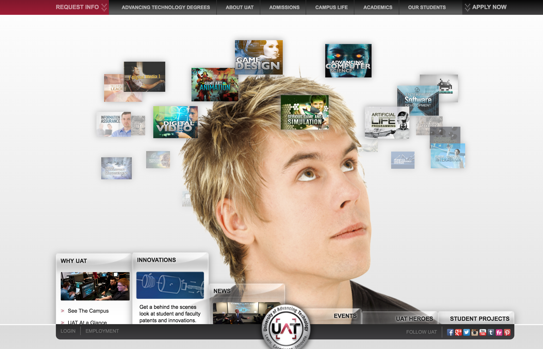
This page has multiple problems. For starters, there is no clear value proposition or explanation for what the site has to offer. Their two CTAs are positioned in the upper corners of the site in non-distinct colors, that blend in with the rest of the text on the page. The boxes surrounding the guy’s head are also rotating, which makes it hard to decipher what each of them say.
Superior Web Solutions

This site’s value proposition, “visit the past in a flash”, does not clearly explain the website’s purpose or services, and the only CTA they have is labeled “enter”. Without a clear value proposition, the CTA is not appealing and does not offer anything to potential customers.
Ling’s Car Rental Site

This car rental website is a overwhelming cluster of CTAs and distracting colors. Although the site’s purpose is clear, there page itself is distracting and confusing.
Gates N Fences
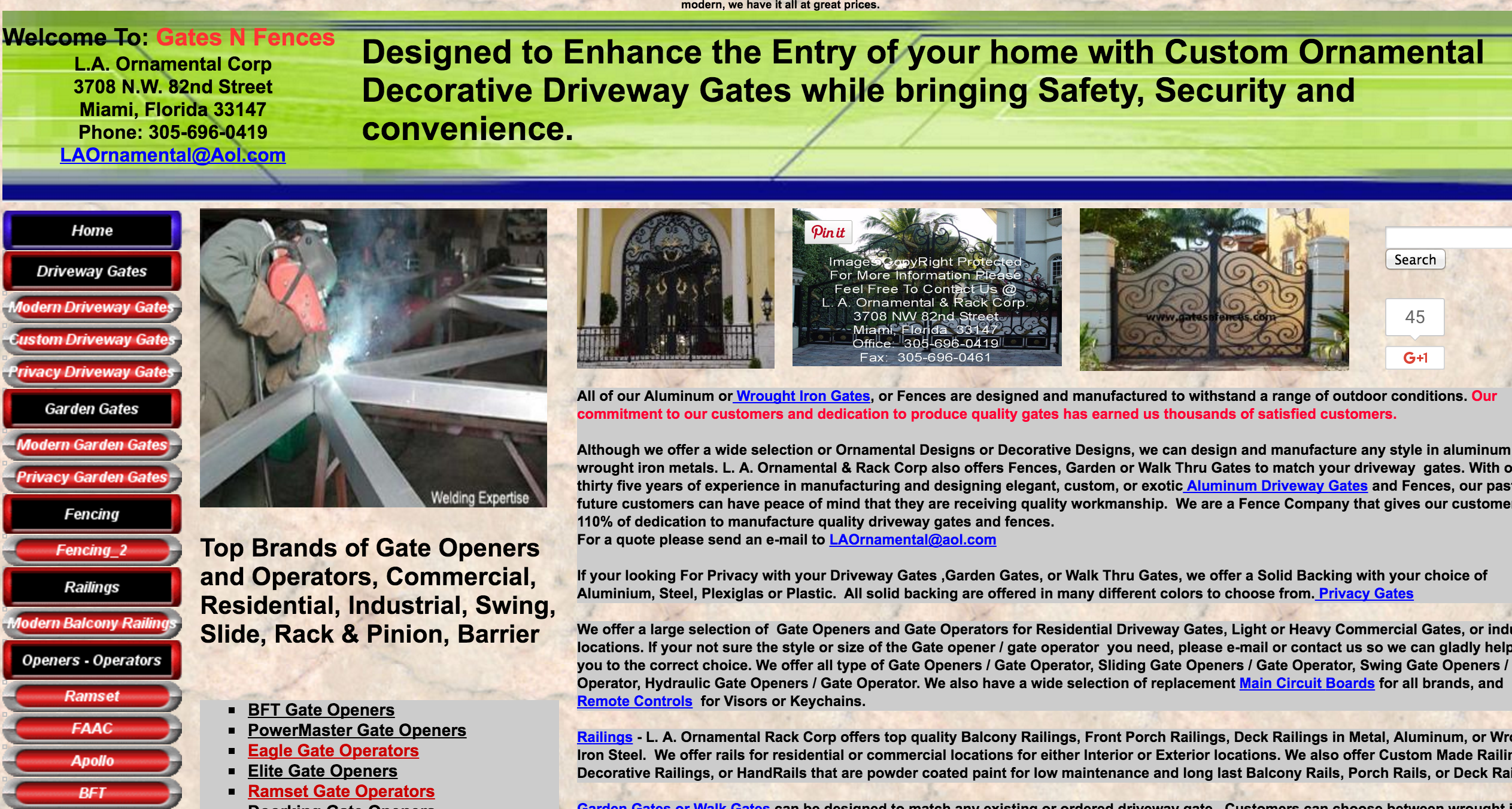
This company’s website has way too much text on their front page. Their value proposition is clear, but for a potential customer, finding the services they need may be difficult with the variety options they have listed on the left.
Join our free Facebook group!
For more tips, tricks, and advice from small business owners, entrepreneurs, and other people growing a brand.


